
One of the clients I worked with at Anthro-tech is Washington State DOR. Like many government agencies, it has a broad audience (small businesses, tax professionals, and general public) to appeal to while having to present large amount of legal information (tax & sales) accurately.
Partnered with a user researcher, I gathered analytics on the current version of the DOR website and redesigned the layout and navigation. The final design is a responsive site with top 10% usability scores from all audiences, and path analysis showing larger percentages of audience reaching their desired destinations for all but one task. The scenario with greatest improvement is finding tax exemptions (18.64% to 75%). The website is well received after launch.
There are a few key design takeaways for me: look for what’s not there, design for tasks, content first, and mobile first. These tend to hold up for other information rich websites that I’ve researched/designed.
Look for what’s not there
Sometimes redesign projects tend to focus on fixing what’s broken, and forget about what’s not there. There was an “ah ha” moment when I showed stakeholders a word cloud of the top search terms that return 0 results (and there is a lot of them) this year. Insights like this tell you what your site is missing.

Design for tasks
When you have a sea of information to offer to people, it’s easy to forgot that people come to your website to achieve their goal, not just to casually browse tax codes. It’s not surprising that a heat map of the clicks on the home page of dor.wa.gov highlights all actions: log in, e-file, find and pay taxes, and search. On mobile, the top picks are login and search. When designing the navigation items (mega menu, footer, side links), think about the pathway it will require for a user to complete his/her top tasks, and what additional information they’ll need to complete the tasks. Is it discoverable? Is it comprehensible?
Content first
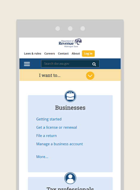
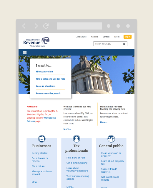
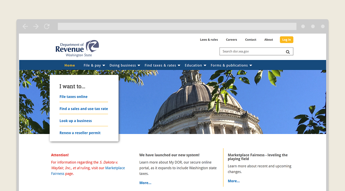
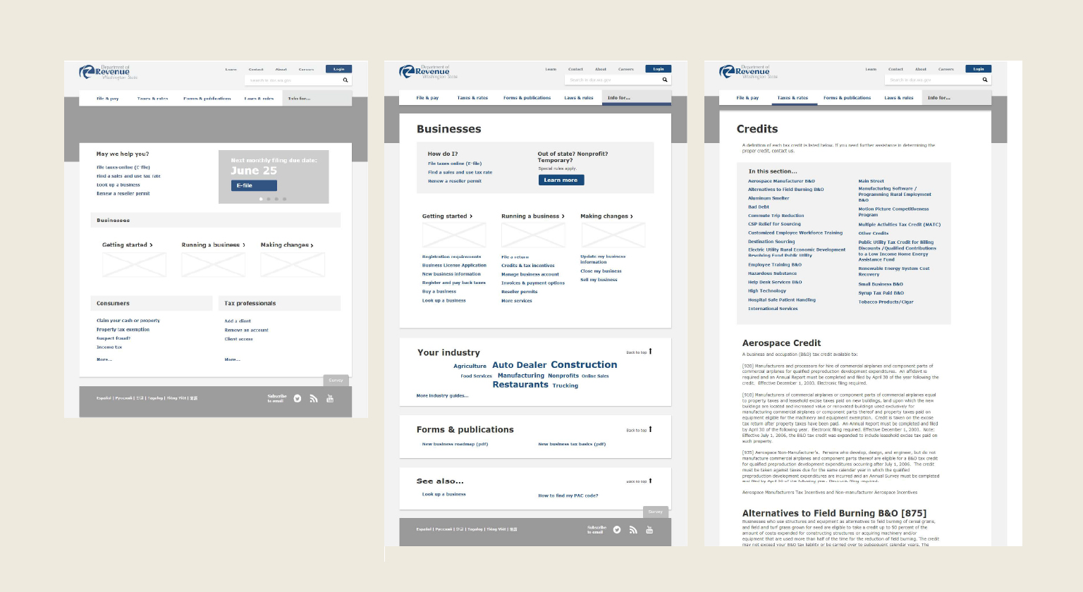
What worked really well in this project is to design a layout specifically for each types of content. For example, a listing page with all of users top actions, key information, and links to related content, to direct users to the right pathway. A content rich page with a table of contents and manageable chunks of sections for easy scanning.
Mobile first
The idea of “mobile first” is that you design for the smallest screen and work your way up. You still need to consider the tasks users are performing and the content you’re communicating. I found it to be a good design collaboration exercise because it forces the stakeholders to prioritize their content, and really think hard on what is essential for users to complete their tasks. Then when it’s time to build the big screen, you can easily lay them out in the same visual hierarchy.